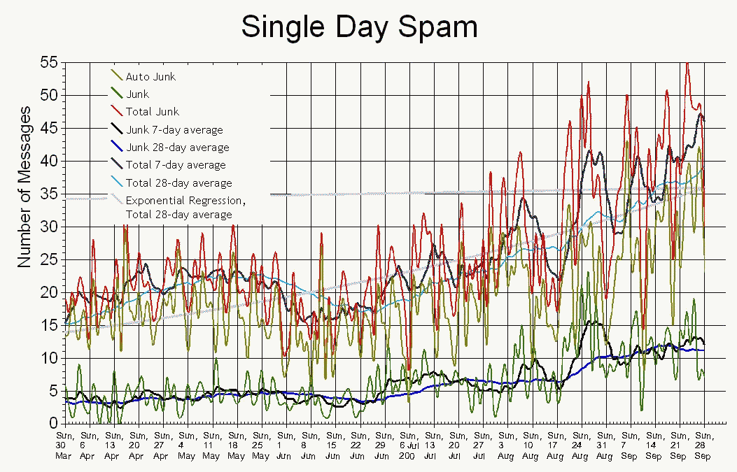
The red line in the previous chart, broken out into the amount of
spam received daily (top red line), automatically filtered (top triplet of lines), dealt
with manually (bottom triplet), and an exponential regression of the
data. The triplets show the daily count of junk messages (greenish), a weekly
average (blackish), and a four-week average (bluish). The blues lines
best indicate the trends of ever-increasing spam. Note the interesting
dip during the summer months. Do spammers go on vacation too?