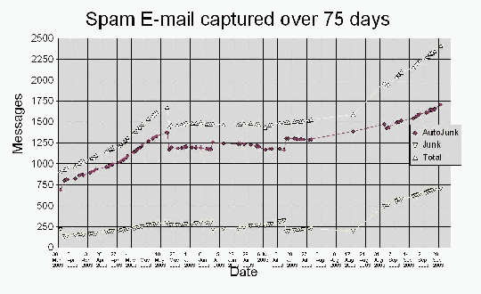
Spam E-mail captured over 75 days.png
31.86 KB
Spam is bad. How bad is it? Since the beginning of the year I've been collecting some statistics on the amount of spam I receive at my work e-mail account .
There's little scientific validity to these stats — they were collected from only a single account, so they can in no way be considered representative of a larger sample. Still, there's no reason to believe these numbers aren't typical for anyone fitting the same profile: My account has existed since about 1996, I subscribe to lots of mailing lists, freely publish my e-mail address on the Web and in newsgroups.
Below are some charts showing the trends up to October 2003. You can see the data in a spreadsheet (junkmailstats.sxc, 253 KiBytes from 23 September 2004, in OpenOffice format), or exported to a Web page (large! 981 KiByte page plus 1.8 MiBytes in chart graphics!). Analysis of more recent data will take place in my copious amounts of free time...
Shows the trend in the amount of junk mail saved over a 75 day period. The top line is the total amount of spam, the second line how much of that was trapped by some filtering rules I created, and the bottom line shows the amount of spam I had to deal with manually. Note the gaps in the samples while I was away on vacation (August 2003), and the adjustments I made in the filtering rules resulting in an increase in the amount of spam caught by the rules (middle line jumps up, bottom line jumps down. Also note the adjustment made in how I collected the stats near the end of May 2003.
I subscribe to several high-volume mailing lists, so I receive LOTS of mail (top line). The average received from Monday to Friday is indicated by the horizontal stepped line. The amount of spam is shown by the red line, and the amount of business related mail is indicated by the bottom-most line. Spam wins... :-( Note the extreme spike of messages on 18 August 2003, caused by someone broadcasting a message to all employees, many of whom had vacation rules which started replying to each other, ad infinitum.
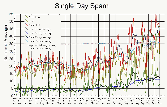
The red line in the previous chart, broken out into the amount of spam received daily (top red line), automatically filtered (top triplet of lines), dealt with manually (bottom triplet), and an exponential regression of the data. The triplets show the daily count of junk messages (greenish), a weekly average (blackish), and a four-week average (bluish). The blues lines best indicate the trends of ever-increasing spam. Note the interesting dip during the summer months. Do spammers go on vacation too?
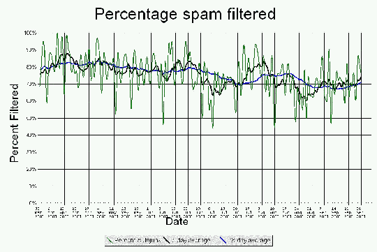
This chart shows the accuracy of my filtering rules. The adjustments that are so obvious in the first chart disappear into the noise on this one. The one apparent trend is that the filtering rules become less effective over time as the spammers become sneakier. All the more reason to use adaptive filtering, for example POPfile.